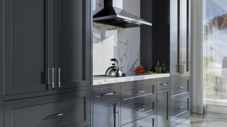
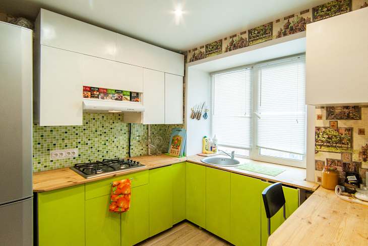
Long gone are the days when you could simply choose a wood stain for your cabinets and be done with it. Now that painted cabinets are en vogue, it’s really anything goes — and colors can run the gamut from tried-and-true neutrals to bold, maximalist hues. But there’s one thing that’s for certain: The color of your cabinets sets the tone for your whole kitchen.
Why Is Kitchen Cabinet Color So Important?
“Cabinet colors are the largest part of the ‘canvas’ in a kitchen,” says Cheryl Clendenon, owner of In Detail Interiors. “The colors, stains, and material selections exponentially contribute to the style of the space.”
Kathryn Humphreys, principal and CEO of Kathryn Murphy Interiors, says that kitchen cabinets don’t just create the vibe in that one space — they actually help tie together the palette and feel of the entire home. “They initiate the personality of the home and the mood of the space,” she says. “I find that the colors we choose in the kitchen reflect who we are and how we want to feel on a very visceral level.”
There seems to be a common thread amongst interiors experts. Calling the kitchen “the heart of the home,” Laura Williams, owner and principal designer of Living Oak Interior Design, echoes that paint colors help to set a mood for a space — something that is “more true than ever” in kitchens.
I asked these three designers what colors they currently have on their kitchen cabinets — and which ones they’d never choose in their own homes. Their answers are illuminating when it comes to learning about colors that work (and don’t work!) for kitchens.
3 Cabinet Colors Designers Would Never Choose for Their Kitchens
1. Nothing Neon
Although bright colors are definitely on the table these days when it comes to kitchen cabinets, Clendenon says that “anything neon” can give people a headache. Instead, in her small kitchen that she says is a “mix of eclectic color,” Clendenon says that her base cabinets are a medium dark walnut, her upper cabinets are painted in Sea Haze by Benjamin Moore, and her island is painted in River Blue by Benjamin Moore.
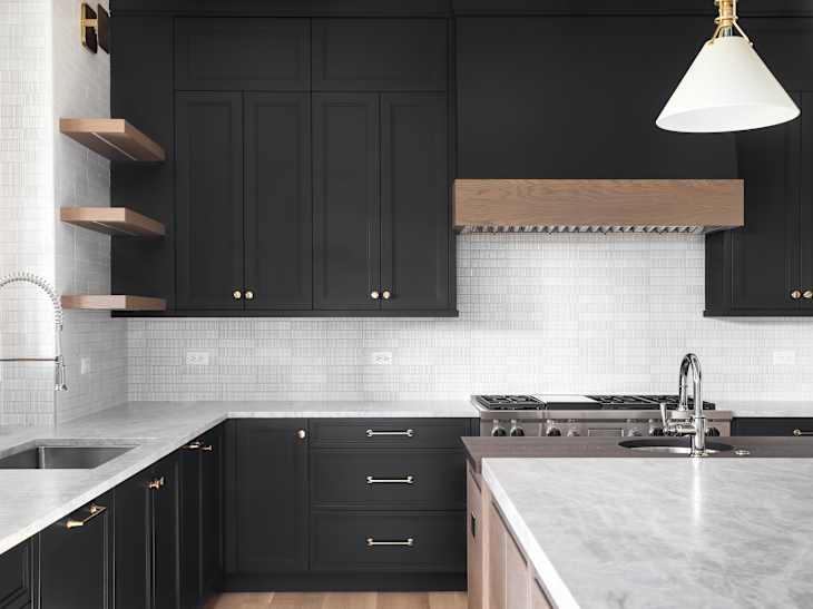
2. Skip the Black
“Never say never, but for me, a black kitchen is not something I want,” Humphreys shares. “I’ve seen many lovely examples, and would consider it for clients, but it’s just not right for me. And of course, the ’90s cherry cabinets are a no-go.” (Clendenon also isn’t a fan of black cabinets, as they can “show dirt horribly.”)
Instead, Humphreys has chosen Green Smoke by Farrow & Ball for her cabinets — which happens to be covering up that ’90s cherry that she dislikes, at least until she’s ready to gut her kitchen. And in her interior design studio, she went with the burgundy-hued Dark Walnut by Benjamin Moore.
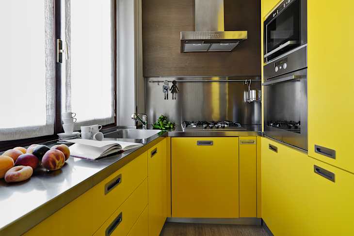
3. Say No to Yellow
Although retro yellow kitchens are making a comeback, Williams says that she would never paint her kitchen a lemon yellow color. “While I love bringing a feeling of sunshine into a space, I feel like cabinetry does not need to be that bright. However, if I had a perfect country home, maybe I would change my mind!”
Instead, she opted for a deep-blue hue in her own home. “My kitchen cabinets are currently a beautiful navy blue color called Mt. Etna by Sherwin Williams. I love the serenity and depth it adds,” she says. “It also prompted me to mix metals and include brass hardware, a stainless steel faucet and oven, and a matte black light fixture.”
What do you think of these designer dos and don’ts? Let us know in the comments below!