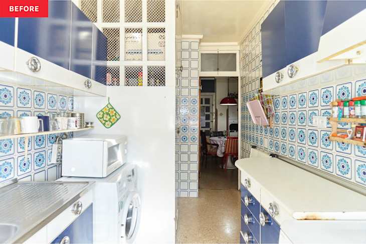
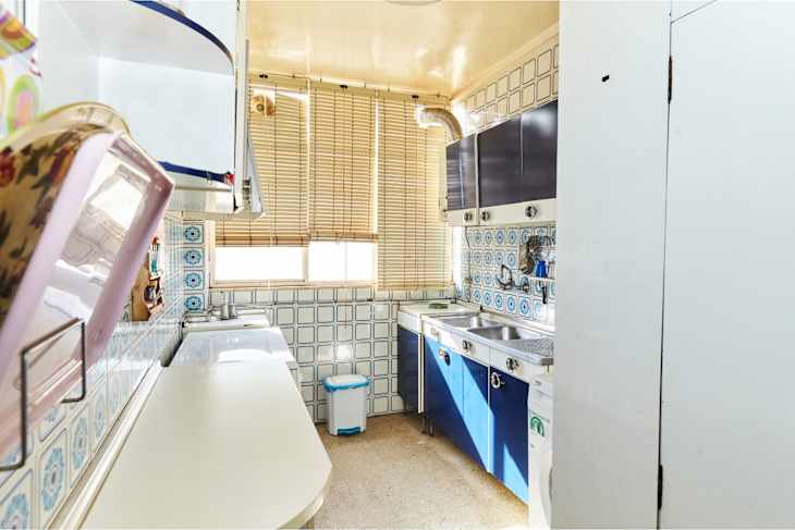
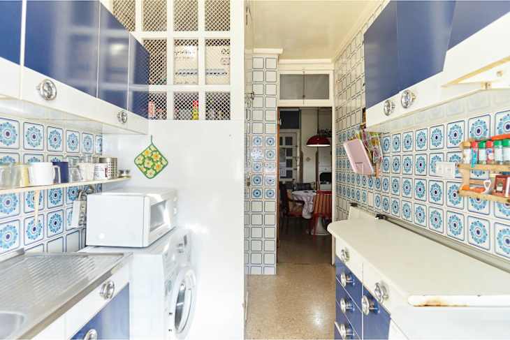
“It was hard to rent it with such an old kitchen,” Ana says. (She and her partner rent out the space to four young women.) Ana and her partner installed the floor, the skirting, the backsplash tile, and the new shelves. The plumbing and painting were completed with professional help.
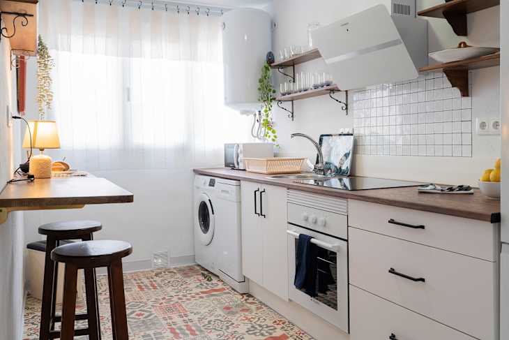
The new kitchen is mostly white with a pop of pattern.
“The tiles and the cabinets were not in good condition after 50 years,” Ana says. “I decided to go for white because it’s an apartment that we rent, so it’s a neutral color.”
She picked basic white paint from the hardware store and peel-and-stick backsplash tiles from Amazon. Ana says it was easy to install the tile once the surface was clean, especially because the tile had lots of straight lines to guide her. “There are tons of realistic tile options,” she adds.
She did add a bit of color to the kitchen with the patterned vinyl flooring. I bought it at [Leroy Merlin], and it’s similar to this one,” Ana says.
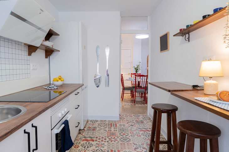
The whole space feels larger.
Part of the kitchen transformation (including new cabinets, new appliances, open shelving, and bar seating) involved taking out the bulky pantry. “Placed next to the kitchen door, it made the room too narrow,” Ana says. “It looks much more spacious now.”
Ana also had the once-navy blue eat-in breakfast area painted white to make the space look more seamless and cohesive. The result? A kitchen that looks twice as big and twice as bright.